Try it without installing
When you finish this page you'll have watched a Sorb™ token change re-theme a running storefront — without installing anything, signing up, or writing a line of code. Pick whichever link fits the two minutes you have.
The 90-second tour
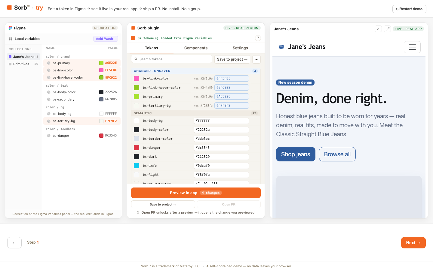
try.sorbcloud.com is a scripted, no-install, no-signup walkthrough of the whole loop: edit a design token in Figma → watch a real storefront re-theme live → ship it as a GitHub pull request. It runs entirely in your browser (a service worker plays the bridge and cloud with canned data), so there's nothing to install and no account to create.
Two of the three panels are the real product, not a recreation: the center
panel is the actual, unmodified Sorb plugin UI, and the right-hand storefront
is a real build of the React reference app running the real @sorb/leaf
preview loop. The Figma panel and the final pull-request screen are staged
and labeled as such in the UI — everything else you click is running live
code.
Use this link when you want the fastest possible answer to "what does this actually do."
The reference storefront
demo.sorbcloud.com is the hosted build of
sorb-demo, Sorb's React + Bootstrap reference consumer. It's a real
storefront wired the way Getting started tells you
to wire your own app: SorbProvider, PreviewBanner, and every visible
control resolving from a CSS custom property. There's no scripted tour here —
you're looking at the same app a developer would clone and run locally.
Five frameworks, the same storefront
The same fictional denim brand — "Janes Jeans" — is rebuilt on five different component libraries, each one first with hardcoded framework defaults and then migrated to Sorb-managed tokens, so you can see the live re-theme land on whichever stack you actually use:
| Stack | Storefront |
|---|---|
| Tailwind v4 + shadcn/ui | tailwind.demo.sorbcloud.com |
| Mantine | mantine.demo.sorbcloud.com |
| MUI | mui.demo.sorbcloud.com |
| PrimeVue | primevue.demo.sorbcloud.com |
| Angular Material | angular.demo.sorbcloud.com |
Each storefront implements the same six screens (home, shop, product, cart, checkout, account) on that framework's own components — buttons, forms, tables, dialogs, and toasts included — so you can judge how far a live token push actually reaches on your stack rather than taking a general claim on faith. Coverage varies by framework: MUI, for example, themes palette, background, text, divider, and radius through CSS variables today, but not typography or spacing.
Next
- Getting started — wire
@sorb/leafinto your own app. - React SDK guide — the same provider wiring the reference app uses.
- How previews work — what's actually happening while you watch a demo re-theme.
Works with Figma. Not affiliated with, or endorsed by, Figma. Figma is a trademark of Figma, Inc.